Making device protection feel fast, flexible, and modern
Before joining Workday, I worked with AmTrust Innovation Labs on a mobile product concept focused on making extended warranties feel more modern, flexible, and connected.
The idea was to let people discover devices in their home, add them to a protection plan, and manage coverage month by month through a simple mobile app.
Rather than treating warranties as static paperwork or a one-time purchase, the product explored a more dynamic model: scan your Wi-Fi network, identify connected devices, estimate their combined value, and let users quickly add selected devices to a plan. The experience needed to feel almost effortless, closer to subscribing to a modern digital service than buying insurance.
The challenge
Warranties and insurance products often feel slow, formal, and full of friction. They tend to involve paperwork, unclear coverage, and a sense that the user only interacts with them when something has gone wrong.
This product needed to feel different. The experience had to communicate that protection could be fast to activate, easy to understand, flexible month to month, connected to the devices people already owned, simple enough for consumers, and adaptable enough to be used as a white-label product by larger partners.
Over the course of the project, the proposition evolved beyond a single branded app. We began exploring how the product could scale as a white-label platform for companies such as Norton, Walmart, Target, or other partners, where the core engine remained the same but the experience could flex to match different brand systems.
My role
My work focused heavily on creative direction, UI design, onboarding, illustration, motion design, and prototyping. I explored multiple visual and motion directions for the product, testing how the app could express qualities like speed, protection, simplicity, and responsiveness without becoming overly decorative or clashing with partner brands.
This included mobile UI design for iOS and Android, onboarding flows, illustration systems, motion design prototypes, white-label theming explorations, partner-branded variants including Norton/Symantec, teaser and promotional motion work for CES, and Principle and After Effects prototypes to test interaction and animation behaviours.
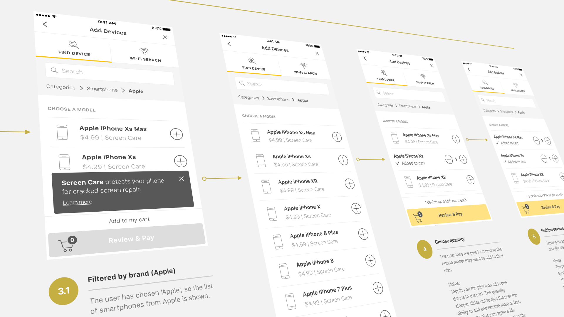
Adding discovered devices to a connected protection plan.
Design principles
Effortless
The experience needed to avoid the heaviness associated with insurance and warranties. Adding devices, understanding coverage, and making claims had to feel simple and immediate.
Smart and connected
The product proposition depended on the sense that the app could understand the user's connected home. Scanning the network and detecting devices was a key part of making the experience feel intelligent.
Nimble
The UI needed to feel fast, light, and responsive. Motion was used not as decoration, but to make the product feel accurate, snappy, and alive.
Flexible
The product needed to adapt both to the user and to potential enterprise partners. This meant designing a visual language that could hold its own, but also step back when wrapped by another brand.
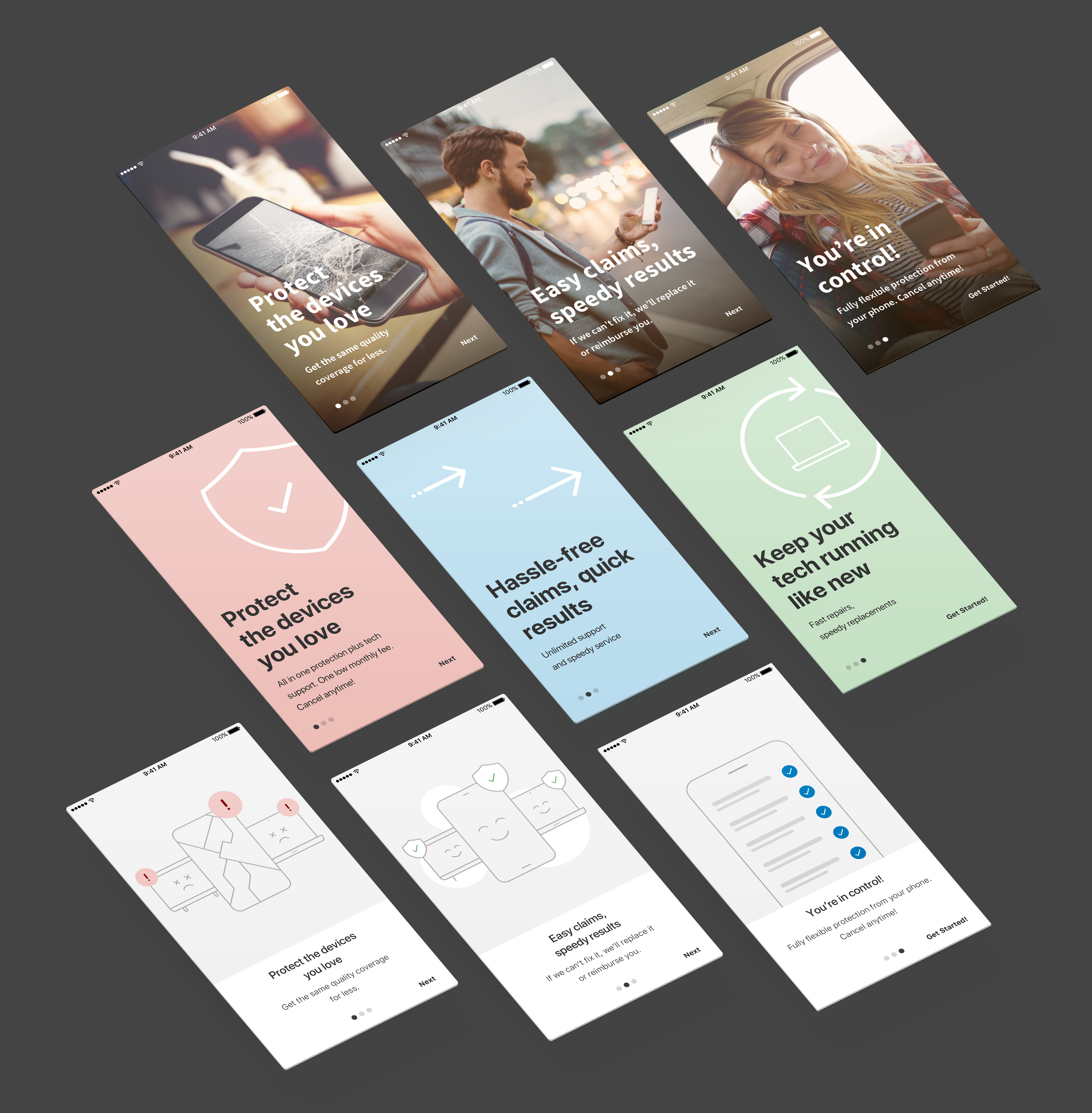
Exploring the onboarding experience
A major part of the work was exploring how the product should introduce itself. Because the concept was new, the onboarding needed to explain the value proposition quickly: protect your devices, make claims easily, get repairs faster, and manage everything in one place.
I explored several creative routes. One direction leaned heavily into typography, white space, and simple messaging. Messages such as "Save money," "Fast repairs," and "Claim in seconds" were used to test whether the proposition could be communicated with minimal visual embellishment.
Another route took inspiration from transit and subway signage: clear hierarchy, focused language, and a strong reliance on type. This helped test whether the onboarding could feel fast, directional, and easy to move through. I also explored a more functional route that surfaced the product benefits directly as a list, reducing the need for metaphor or animation.
From there, I explored a more expressive visual language using simple line illustrations. These introduced more personality while still staying aligned with the restrained UI. The illustrations focused on subtle metaphors: protection, damaged devices, repair, speed, and connected devices.
Motion explorations helped communicate speed, protection, repair, and resolution.
Using motion to communicate product qualities
Motion was not treated as a layer of polish added at the end. It was part of how the product communicated its personality. Because warranties and claims are often perceived as slow, the app needed to feel the opposite: quick, fluid, and responsive.
I used Principle to prototype lightweight mobile interactions that could be tested directly on a device. This was useful because the feel of the interaction mattered as much as the look. A video could show the animation, but a tappable prototype made it possible to feel whether transitions were responsive, believable, and appropriately timed.
I also used After Effects for more polished motion explorations where the goal was to test richer visual storytelling and transitions between onboarding states. The motion language aimed to create a sense of speed, accuracy, lightness, repair and resolution, confidence, and modern service quality.
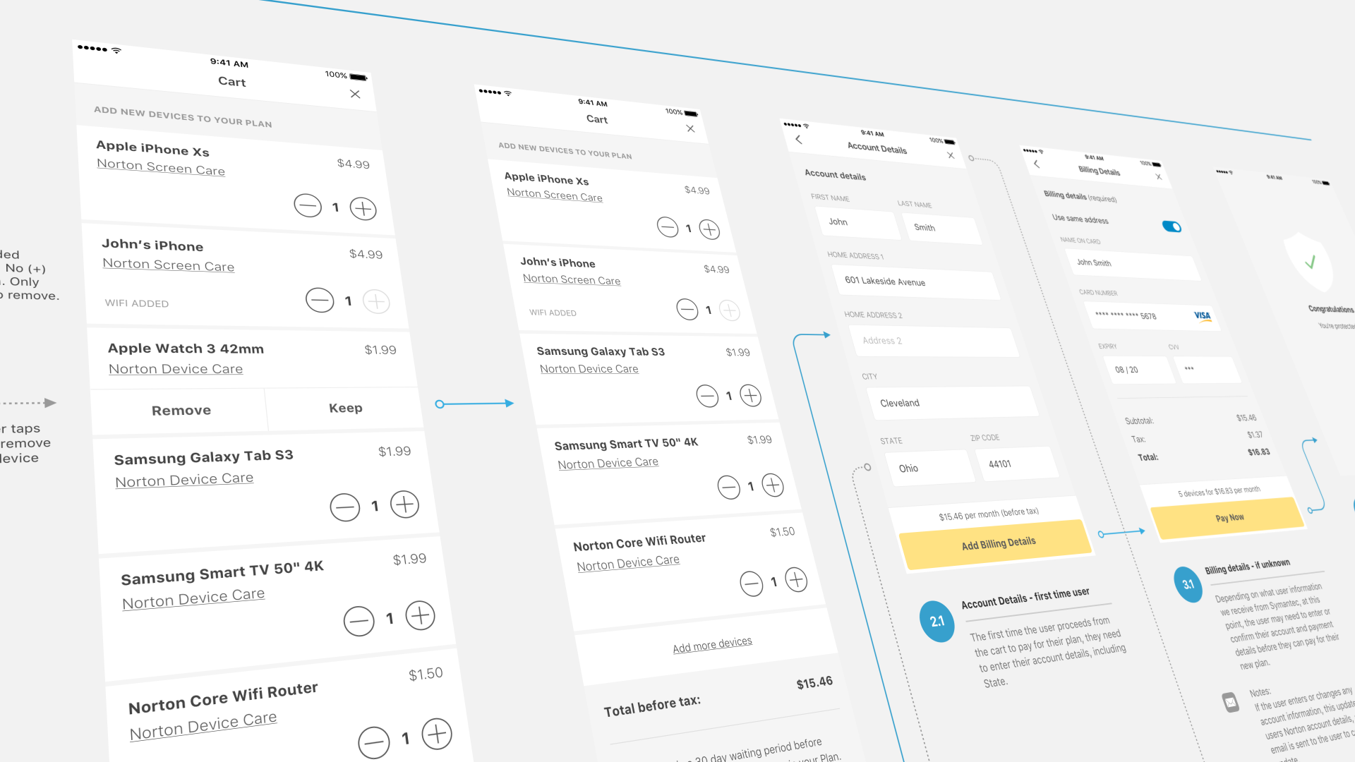
Checkout and plan flows needed to feel closer to a digital subscription than a traditional insurance product.
Designing for white-label flexibility
As the product evolved, the white-label opportunity became more important. The product needed to work as a branded experience for external partners while still preserving the core TapSafe engine underneath.
In the Norton/Symantec example, this meant designing onboarding and product flows that could feel aligned with Norton's brand expectations while still connecting smoothly into the underlying app experience.
I explored how different levels of brand expression could be supported: partner-approved photography, partner colour accents, minimal typographic onboarding, lightweight illustration-based onboarding, more playful motion-led onboarding, themeable UI wrappers, and multilingual layout testing.
For Norton, the selected direction leaned more heavily on approved brand imagery, paired with subtle use of the Norton yellow to connect the login and onboarding experience into the rest of the app. This helped establish a flexible model: some partners could use a conservative branded photography approach, while others could choose a more lightweight, illustrative, or playful route.
Outcome
The project produced a broad set of product, onboarding, illustration, and motion explorations that helped define how a smart warranty product could feel modern, fast, and brand-adaptable.
It also helped establish a direction for how the product could scale beyond a single app into a white-label platform for enterprise partners.
For me, the project is a useful example of how I approach creative direction in product design: not as surface styling, but as a way to translate product principles into interaction, motion, visual language, and brand flexibility.
What this project demonstrates
Product PropositionCreative DirectionMobile UI DesignOnboardingIllustrationMotion DesignPrinciple PrototypingAfter EffectsWhite-Label ThemingPartner Brand Systems